It’s somewhat easy to look at the new Control4 Smart Home OS 3 and summarize it as a largely cosmetic overhaul – at least at first glance. The bold new look is, after all, the first thing that catches your eye. For the first time since this advanced home control and automation platform hit the market a decade-and-a-half ago, its user interface looks truly modern. Forward thinking, even. More Apple than Microsoft. Big, bold, animated iconography dominates the various screens that comprise the Control4 user experience, whether it be via touch screens, mobile apps, or on-screen display interfaces for TVs in and around the house.
Honestly, if this sort of cosmetic coat of paint was the beginning and end of Smart Home OS 3, it would be a worthwhile (and long-needed) redesign for Control4. But this fresh new look and sexy new layout is literally just the surface of what turns out to be a pretty massive re-jiggering of how Control4 works – or at least of how the homeowner interacts with the system. And in the end, lovely as it all is, the fresh aesthetic is probably the least interesting thing about OS 3.
[Find out more about the Control4 OS 3 announcement here.]
To understand the real appeal of this new OS, let’s step back and consider one of the most dominant trends in the world of professionally installed automation over the past few years. There’s been a bit of a tug-of-war as of late between two opposing initiatives: on the one hand, giving homeowners more capacity for customization of their professionally installed home automation systems, allowing them to create new lighting scenes, program simple automation events, etc.; and on the other hand, protecting the work of custom installers – in other words, ensuring that homeowners can’t break their own systems with all of this customization, resulting in headaches for the pros who have to roll a truck every time the system stops working correctly.
Control4 Smart Home OS 3 doesn’t call a complete ceasefire in this struggle; after all, the new OS still allows a homeowner to easily create and edit lighting scenes via the Control4 UI, and it still supports When >> Then, a web-based interface that walks end users through the process of creating simple automations, e.g., turning on the front porch light at sunset and off again at sunrise, or triggering a specific lighting scene when, say, the Kaleidescape movie server in the main media room is playing a movie.
But OS 3 does de-escalate tensions a little by introducing a whole new level of personalization that changes the look and feel – and indeed, some of the functionality – of Control4, without actually modifying the underlying nuts-and-bolts programming. This gives the homeowner new and interesting ways to tweak, personalize, and even organize their home automation systems, without adding to the stress-load of dealers who might worry that some careless tweak or another might break their meticulous programming.
Control4 OS 3 Favorites
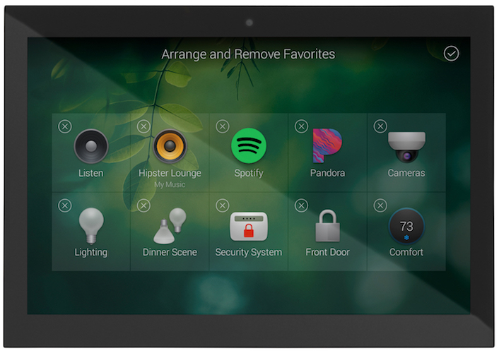
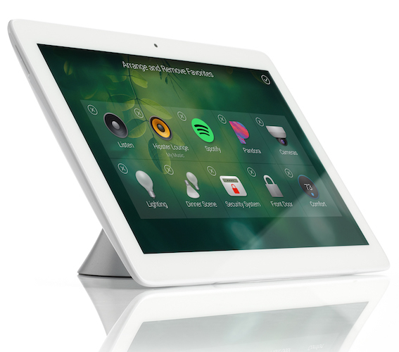
The centerpiece of Control4’s new initiative is Favorites, and the way they work is equal parts intuitive and innovative. Put as simply as possible, Favorites allow you to break out of the sort of nested control structure that has defined the Control4 experience to date. For example, you may have multiple video source devices in your den or media room or living room, or wherever your family gathers to watch movies and TV. Do you use them all in equal proportion, though? Likely not.

But before now, they were all accessed in the same way: either by pressing the Watch button on the remote, touch screen controller, mobile app, or Control4 on-screen interface, and scrolling through the list of devices therein to find the one you want. But what if you’re like my wife and me, who watch our Roku Ultra 10 times as much as, say, our UHD Blu-ray player or Kaleidescape or, until we recently cut the cord, our Dish Network DVR? Using the Favorites functionality, it was simple enough for me to press-and-hold the Roku icon and add it to the main page of the Den portal of our Control4 system. Lights and thermostats and sound sources and locks and so forth all work the same way. Any device that you use more than the rest can be pulled out of those familiar sub-menus and plopped right onto the room screen.
One of the handiest uses of Favorites, at least in our home control system, has been adding our front door lock to the main screen of the Control4 App. So now, when my wife and I are within sight of the house and want to unlock the door ahead of our arrival – which is especially handy if we’re dragging in a bag or twelve of groceries while also wrangling our 80-pound pit bull, Bruno – we don’t have to fumble through the Security screen, down a level into Locks & Sensors, and pick the front door out of a list of all our locks. The door we use the most is literally just a single button-press away.
You can also Favorite rooms themselves, which may be handy if your home control system is heavily compartmentalized. In the Change Rooms menu at the top of the screen, simply press the little pencil and place a heart by the rooms you occupy or use the most, and they can now be accessed via swiping left or right in the app or via Control4 touchscreens, rather than navigating the Change Rooms menu every time. It’s smart. It’s simple. And like most other things in OS 3, it just makes sense.
Arrange Control4 Icons and Adding Wallpaper
The other really cool thing is that the same press-and-hold mechanic driving Favorites also now allows you to arrange and even remove icons from your room control screens. If you’re anything like me, you probably don’t want your climate control system accessible from every control interface in the house, especially when your cold-natured mother-in-law comes for a visit. It’s super easy to move the thermostat deeper into the UI, or remove access to it from any room in the system. Or, at the very least, from the main screen of any given room.

And you may be thinking to yourself, “Eep! If the thermostat is deleted from a room, isn’t it permanently gone? Will a Control4 dealer be required to get it back?” Nope and nope. The real beauty of this new interface is that no matter how much you customize and rearrange the main control screen of any given room, all of your devices and lighting scenes and so forth are still accessible by pressing the circled “4” in the upper left of the screen on the touchscreen or mobile app, or by scrolling left on the on-screen display. Doing so brings up the full, untouched Watch/Listen/Lighting/Security/Settings menu for that room, in a little pop-up box somewhat similar to the old Gadgets menus from Windows 8. (No matter what you thought of Windows 8, mind you, it works great here).
The long and short of it is that you can have a sort of dual-tiered user experience here: one that appeals to the technologically averse or those who simply want the simplest home control experience, as well as the more advanced user who wants access to everything.
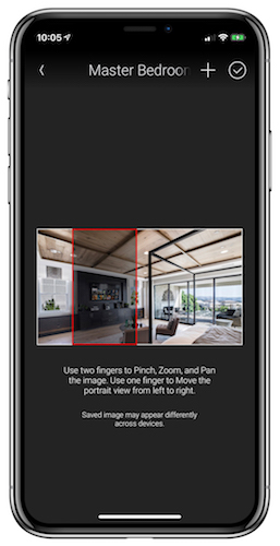
Other personalization functionality comes in the form of wallpapers, which can easily be set independently for each room. You can choose from a large grouping of designer-curated imagery or upload your own custom photos via the mobile app. If you’d like, you can match the look of the touch screens and apps to the wallpaper or paint in the room, or take a photo of the room itself to make each room’s UI easily recognizable at a glance. I imagine that intrepid Control4 dealers might even cook up their own custom graphics that sort of represent or evoke the platonic ideal of, say, a master bedroom or den or kitchen or bathroom, to give each room in the home a clean-but-distinctive look.
My Minor Complaints about Control4 OS 3
If I have any beefs with this new OS 3, they are few and minor. I do like the fact that the Control4 user interface adapts itself to each individual control device, so your mobile app works slightly differently than your touchscreens, or the on-screen display on your TVs. But I don’t like that sometimes these adaptations might not completely comport with the way you use your system.
Lighting is no longer accessible via the on-screen display on TVs, for example, unless you Favorite a light, in which case you only get on/off access, not dimming capabilities. You have to use the touch screen or mobile app to dim, or to open shades partially, or what have you. Do most people use the on-screen display to dim lights? No. Does my aforementioned mother-in-law when she visits? Yup. So, that’s a conversation I’m not looking forward to having in a few weeks.
The good news is that if there’s enough of an outcry, that’s the sort of thing that could easily be addressed in a future patch to OS 3. And to be honest, as I adapt to this new way of interacting with my Control4 system, that may be the sort of thing I just adjust to over time.
One potentially more serious caveat is that this new OS release does mark the end of life for some older hardware. The HC-250, originally released in 2012, doesn’t support OS 3. Neither do older touchscreens. So some freshening up of hardware may be required for older systems.
Favorite Things About Control4 OS 3
There’s simply so much to love here – and so much that I’m leaving unsaid due to space constraints, as well as the fact that my home is uniquely mine, so I can’t possibly tap into all of the new capabilities of this updated Smart Home OS (e.g. new functionality for distributed audio and video, nor the updated pool/spa control screens).
In addition to Favorites, though, one of my favorite new things about OS 3 is the Active Media Bar, which allows you to see – from the home screen of a room – what audio or video devices is playing in that room, with basic transport controls and a handy volume slider that is seriously just the best thing since online banking. When you’re currently watching a video source, you can also access gesture pad controls, which – in my humble opinion – make the mobile app truly viable for home theater control and even channel surfing for the first time ever.
For my wife, on the other hand, the absolute best thing about OS 3 is the new filter button for lights. In previous versions of Control4’s OS, it was easy enough to sort your individual lighting loads and lighting scenes by room or the whole house. OS 3 takes things one step further by letting you tap a little filter icon at the bottom of the screen, for example, and see every individual lighting load in the house that’s currently on, while ignoring any lights that are currently off.
It may sound like such a simple thing. Such an obvious thing. But little additions like that make Control4 OS 3 the most intuitive, accessible, and meaningfully customizable professionally installed home automation system I’ve ever laid hands on. For what it’s worth, it’s also one of the prettiest, and although I sort of dismissed this saucy new look as one of the least interesting things about OS 3, it’s hard to deny that it’s also one of the most compelling things about this massive update.


![Jasmine-House_Back-Exterior-Night-View_H-scaled Coastal Source installed over 200 lights in this sprawling luxury property, resulting in a stunning display of landscape lighting design. [Photo credit | Coastal Source]](https://restechtoday.com/wp-content/uploads/2025/05/Jasmine-House_Back-Exterior-Night-View_H-scaled-1.jpg)
