Crestron’s New-Look User Interface
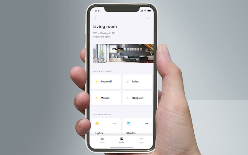
Crestron, long the leader in custom-programmed home control systems, has introduced a complete update to their residential operating system and app that were designed from scratch with new features, an interface that’s easier to navigate on mobile devices and Crestron TSW touch screens, and faster deployment for integrators, with no programming needed. To make Crestron Home OS 3 a reality, Crestron hired more engineers and went to work changing APIs and writing native applications for iOS and their touchscreens/Android devices.
Aesthetic design and “user friendliness” of the OS3 app were equally important to performance goals, according to Doug Jacobson, Crestron’s director of residential technology. “It’s one thing to have the app or touchscreen interface be really responsive, it’s another thing to have a gorgeous user experience,” he said. “But it’s more than just aesthetics, but how do you perform certain tasks? How do you discover things, for someone who is picking up the app for the first time? How does this look and make you feel?”
During the development of OS3, Crestron sought feedback not only from its dealers, but also end users, asking them to perform a small task and record the results. Here are five important things to know about OS3:
Forces Pyng ‘Sunset’
While OS3 will obviously replace OS2, it also eliminates the need for the company’s popular Pyng platform going forward. Custom integration dealers may still opt to use “traditional” Crestron programming tools, however. Particularly in massive projects, there may be limitations for how far a system designer might want to push OS3, leading to the need for a custom-programmed system. Crestron encourages its dealers to visit their website to explore what Crestron Home can do and what they company is developing for the system.
Enables Quicker Access to Active Media
OS3 enables more efficient access to active media in the home, such as music that’s playing from a streaming service or TVs that are on. At any point in the app, you can quickly get to those controls via a media bar that pops up at the bottom of the app whenever a room is active for audio or video. When you touch that bar, you get a list of those rooms. You then turn them all off or adjust the volume or mute. Then with the click of a button, you can dive into the full controls for that room, whether it’s audio or video.
Creates Interfaces That Are ‘Room-centric’
The most fundamental change that Crestron made within the structure of OS3 was moving from a “system-based” to a “room-based” user experience. With Pyng, for example, a homeowner might want to control their home lighting and would see a list of all of the rooms with lights or she would want to play music and see a list of all of the rooms with audio in them. OS3, instead, focuses on rooms and what options are available in them.
Provides Easier Access to Favorite Rooms
Another feature, called “Room Favorites” allows someone who has, say, 40 rooms in their house but spends most of their time in four or five of them to select those favorites and those rooms always pop up to the top of the list for that user.
Offers Multi-Home Support and Personalization
Additional OS3 features include support for multiple homes, personalization of the UI using photos of the home to represent rooms, and enforced end-to-end encryption for secure communications.


