Crestron has officially released Crestron Home OS 3, a complete update to its operating system and app that were designed from scratch with new features, an interface that’s easy to navigate on mobile devices and Crestron TSW touchscreens, and fast deployment for integrators, with no programming needed.
“It’s a completely new user experience,” said Doug Jacobson, Crestron’s director of residential technology. “We basically started from the ground up.”
Crestron’s previous OS2 and Pyng systems used the same back-end programming that Crestron dealers continue to use to deliver fully custom experiences. OS3, while less open to customization, provides faster deployment of systems and responsiveness of the app and the speed in which it communicates with the black boxes behind the scenes in the home.
To make OS3 a reality, Crestron hired more engineers and went to work changing APIs and writing native applications for iOS and their touchscreens/Android devices. A separate team of engineers developed the iOS app, while another team worked on the touchscreen/Android version, utilizing the standard app-building tools that those platforms provide (scrolling lists and image management, for example), instead of building them from scratch. The same team working on the touchscreen application is still working to complete an Android version, which is promised to be available soon.
Jacobson explained why Crestron chose not to use a “cross-platform” technology for iOS and touchscreen/Android. “It would have been a faster way to deliver an app, but it also might slow down performance.”
OS3 Design Goals
Aesthetic design and “user friendliness” of the OS3 app were equally important to performance goals, according to Jacobson. “It’s one thing to have the app or touchscreen interface be really responsive, it’s another thing to have a gorgeous user experience,” he said. “But it’s more than just aesthetics, but how do you perform certain tasks? How do you discover things, for someone who is picking up the app for the first time? How does this look and make you feel?’ This is an extension of someone’s home, and we wanted it to be when they opened the app, they felt delight or satisfaction with this technology purchase that they made. We threw out everything and started from the ground up.”
During the development of OS3, Crestron sought feedback not only from its dealers, but also end users, asking them to perform a small task and watched and recorded results.
While OS3 will obviously replace OS2, it also eliminates the need for the company’s popular Pyng platform to exist, going forward. Custom integration dealers, however, may still opt to use “traditional” Crestron programming tools.
“On the one side you have traditional programmers and UI designers working on a custom installation, then you have Crestron Home, where Crestron controls the user experience, it’s the dealer’s responsibility to design the system, install the system, and configure with Crestron Home and provide a great outcome to their clients,” Jacobson noted.
There are limitations, particularly in massive projects for how far a dealer might want to push OS3, leading to the need for a custom-programmed system. Crestron encourages its dealers to visit www.crestron.com/home to explore what Crestron Home can do and what they company is developing for the system. “We’re very upfront with where it’s appropriate and where it’s not,” Jacobson said.
How OS3 is Different
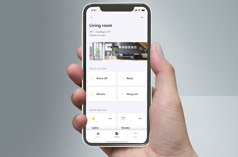
The most fundamental change that Crestron made within the structure of OS3 was moving from a “system-based” to a “room-based” user experience. With Pyng, for example, a homeowner might want to control their home lighting and would see a list of all of the rooms with lights or she would want to play music and see a list of all of the rooms with audio in them. OS3, instead, focuses on rooms and what options are available in them.
“Where are you right now? OK, you’re in the kitchen? Here’s everything that you can do in the kitchen, from lights to shades to audio and video, right at your fingertips,” Jacobson illustrates.
Another significant design change in OS3 is quick access to active media (music that’s playing or TVs that are on in the house.) At any point in the app, you can quickly get to those controls.
“There’s a little media bar that pops up at the bottom of the app whenever a room is active for audio or video,” Jacobson explained. “When you touch that bar, you get a list of those rooms. You then turn them all off or adjust the volume or mute. Then with the click of a button, you can dive into the full controls for that room, whether it’s audio or video.”
Another feature, called “Room Favorites” allows someone who has, say, 40 rooms in their house but spends most of their time in four or five of them, can select those favorites and those rooms always pop up to the top of the list for that user.
“We tried to make the most common things bubble up to the top, so you don’t have to drill through a bunch of menus to get to the most common things,” Jacobson added. “Another example might be a ‘quick action’ like a Good Night scene that can involve lights and shades and audio and video. Those things are designed by the dealer but are immediately available, whether it’s a house quick action or room quick action. When it comes to lighting and shades, one of the most common things you do is turning them on or off, so rather than having to dive into a lighting page to turn them on or off, we have a lighting tile, and the lighting tile lets you get deeper into that screen, but if you just tap the tile, it toggles the lights on and off.
Additional OS3 features include support for multiple homes, personalization of UI using photos of home to represent rooms, and enforced end-to-end encryption for secure communications
Jacobson said that Crestron decided well over a year ago to create OS3. “The fact that it’s coming out now really is a testament to how much work it took to get to this point,” he said, noting that customer expectations have changed, driven by the iPhone.
“People just expect apps to look beautiful and to behave like modern apps, and be really responsive,” he added. “We thought the best way to get there was to start over. We didn’t want to be somewhere five years from now and still working something that we didn’t think could grow well with us from a technology standpoint.”


![ecobee premium airzone control The ecobee Smart Thermostat Premium. [Photo credit | ecobee]](https://restechtoday.com/wp-content/uploads/2025/06/ecobee-premium.jpg)
![Hub 3_02 The SwitchBot Hub 3 provides a user-friendly solution to the growing complexity of modern smart homes. [Photo credit | SwitchBot]](https://restechtoday.com/wp-content/uploads/2025/06/Hub-3_02-scaled-e1750179791687.png)
