Changing out the remote control in a family’s central TV-watching area is an undertaking that one cannot take lightly. So, the switch from Control4’s button-laden workhorse remote to its re-introduced minimalist Neeo Remote (the Switzerland-based brand that it acquired back in February) was met with early trepidation in my home.
While we were initially blown away by the Neeo’s design aesthetic, its lack of buttons and dependence on an embedded touchscreen also required a bit of “relearning” by my family on where to find certain essential controls. Now that we’ve got a handle on the new design, however, going back to our original Control4 remote would feel like switching from an iPhone back to a flip phone.
Taking the Neeo Remote Out of the Box
Introduced in 2016, Neeo’s remote gained relatively fast industry recognition for its simplistic set up, out-of-box interoperability with thousands of devices, and most notably, its beautifully conceived industrial design. Following the Control4 acquisition, the Bern, Switzerland-based Neeo product team began working with the Control4 engineering group in Salt Lake City on the development of this next-generation version of it flagship controller, which would need to be compatible with the recently released Control4 Smart Home OS3.
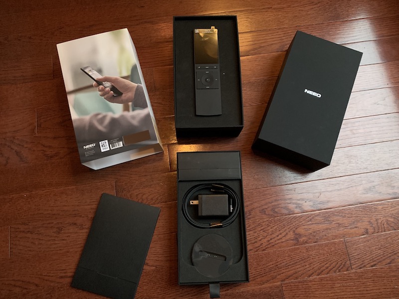
Right out of the box (literally) it is clear that the Wi-Fi-connected Neeo, while still a pro-level device, is meant to be consumer-friendly enough to be added to a system without integrator intervention. The packaging is exquisite in a direct-to-consumer sort of way and not the type box that you would feel comfortable chucking right in the trash. If you’re a Control4 customer running OS 3.1, you can, theoretically, install the Neeo Remote yourself, but the order still must go through your Control4 dealer. New Control4 customers, however, must not only buy their Neeo Remote from a Control4 dealer, but have it installed by them, as well.
The Control4 team was so confident in me and the user friendliness of the new remote, apparently, that they sent it directly to me for “installation,” even though I am not trained to use Control4’s Composer programming software. That plan hit a snag or two, unfortunately, as I found that my system was not yet upgraded to OS3.1 (I only had OS3), which had to be done remotely by my integrator. Also, one of the key features of the Neeo Remote is the addition of favorite channels, which had not yet been enabled by my integrator in Composer. After watching that Smart Skill video, my pal Andy at Millennium Sounds in Indianapolis had my remote working as promised, but integrators are wise to prep customer systems ahead of time or to stay close by to make minor adjustments post-sale of the remote to those who wish to “self-install.”
The Look and Feel of the Neeo Remote
The fit and finish of Neeo Remote’s machine aluminum chassis is unlike any remote that I’ve ever held in my hand. There’s a proper amount of weight to keep the ultra-slim design from flying away like a slippery bar of soap and a subtle rubberized surface material coating the back and buttons that feels like the matte finish of a fancy magazine.
Available in black or silver, the Neeo Remote charges upright in a cradle that is weighted down (355 g; 12.52 oz.) for stability and magnetized to keep the remote from getting easily knocked out of place. While the 81 mm (3.2-inch), high-resolution touchscreen and software-driven graphical interface reduce the number of buttons, the remote still includes physical buttons for the essentials like Volume Up and Down, Channel Up and Down, the selector wheel, Mute, Menu, Home, and Power On/Off. This is where the family “re-training” came in.
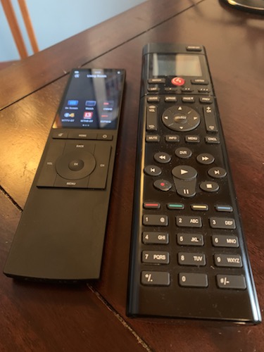
Initially, my 11-year-old daughter, who loves to watch recorded versions of her favorite competition shows, like the Voice and American’s Got Talent, was perplexed by the lack of playback buttons on the remote. I had to show her how to swipe left or right on the touchscreen to find the appropriate page for Play, Pause, Stop, Rewind, Fast Forward, and Record. It’s not as intuitive, initially, as one might hope.
Even after we eventually adjusted our habits, there’s still the challenge of hitting the right spot on the remote to resume playback after fast forwarding through commercials. This is definitely not a remote for those who require a more tactile experience. I’m not yet 50, so I can still manage to keep my index finger hovering above the playback button while zipping to the next segment of my favorite show, avoiding commercials, but I can’t imagine my 70-plus year-old mom having that same level of dexterity, and, the Neeo Remote unfortunately lacks voice-control options. (I know… first-world challenges.)
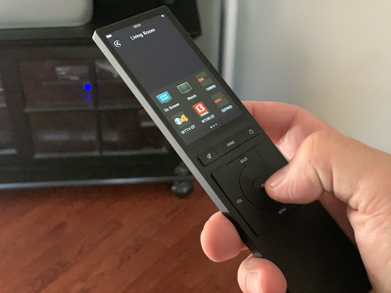
The other options within my “Cable” playback touchscreen experience are the numbered keypad on one page and the much lesser used function keys on another. Having the Favorited icons of my most-viewed TV channel right on the home screen is probably the most useful new function of the Neeo Remote.
To win my wife over, I made sure to place CNN in the number-one position, so she no longer has to first press “Watch” followed by the source (Cable, Apple TV, Blu-ray, or Wii) and then punch in the channel number, which involves four digits on our Uverse system. Now, she can simply pick up the remote and hit the CNN logo, and it goes straight to the only channel that she ever watches. Adjustments to Favorites cannot, unfortunately, be made directly in the remote, but they are changed relatively easily within the app and then immediately updated on the remote.
On the home page of my remote, I can also select Listen, which controls my third-party multi-room audio system. For those using a streaming device within the Control4 family, this operation would also enable access to music stations, as well. I have access to Lighting, also, which connects me to all of the Control4 dimmers in my system, as well as my lighting scenes throughout the house. Climate control is also available for adjusting your smart thermostat.
It’s great that the Neeo Remote controls television, movies, music, lights, thermostats, and virtually anything else in a Control4 Smart Home, but for me it’s still most important that my primary remote control does the little thing rights, first and foremost. I want it to power on and off the correct devices in my relatively complicated stack of TV, AV receiver, cable box, Blu-ray player, Apple TV, and Wii controller, and never get out of sync; the Neeo Remote has done this flawlessly in the first two weeks that I’ve been using it. It also features easy-to-locate Volume, Channel, and Mute buttons, which are wisely still tactile buttons, providing some semblance of familiarity for many consumers who are used to a traditional button push.
While I’m still adjusting to the touch screen pages and how to find certain control buttons, even the best product designs (and this is one of them) require a learning curve for the end user.
Is this remote the perfect fit for all Control4 customers? No, but it’s a much-needed replacement for many consumers who had owned a Control4 remote that was beginning to show its age and was too button-laden and bulky to serve as the face of the sophisticated technology that Control4 has working behind the scenes in thousands of smart homes across the country. I think it’s a winner and well worth the learning curve.




![ecobee premium airzone control The ecobee Smart Thermostat Premium. [Photo credit | ecobee]](https://restechtoday.com/wp-content/uploads/2025/06/ecobee-premium.jpg)
![Hub 3_02 The SwitchBot Hub 3 provides a user-friendly solution to the growing complexity of modern smart homes. [Photo credit | SwitchBot]](https://restechtoday.com/wp-content/uploads/2025/06/Hub-3_02-scaled-e1750179791687.png)
